Overview
So far in this series (if 3 posts can be considered a series), we have ingested data into PowerBI and created a basic report. We looked at some of the pitfalls that may happen when creating a table view.
In this post, we will look at the tables themselves and how we can expand on the information we have downloaded.
Parsing JSON
We have already extracted the Owner’s name and Email address in the KQL query that we used to extract the data. What if we didn’t do that? Can we still get to the data? Yes. PowerBI makes it quite easy.
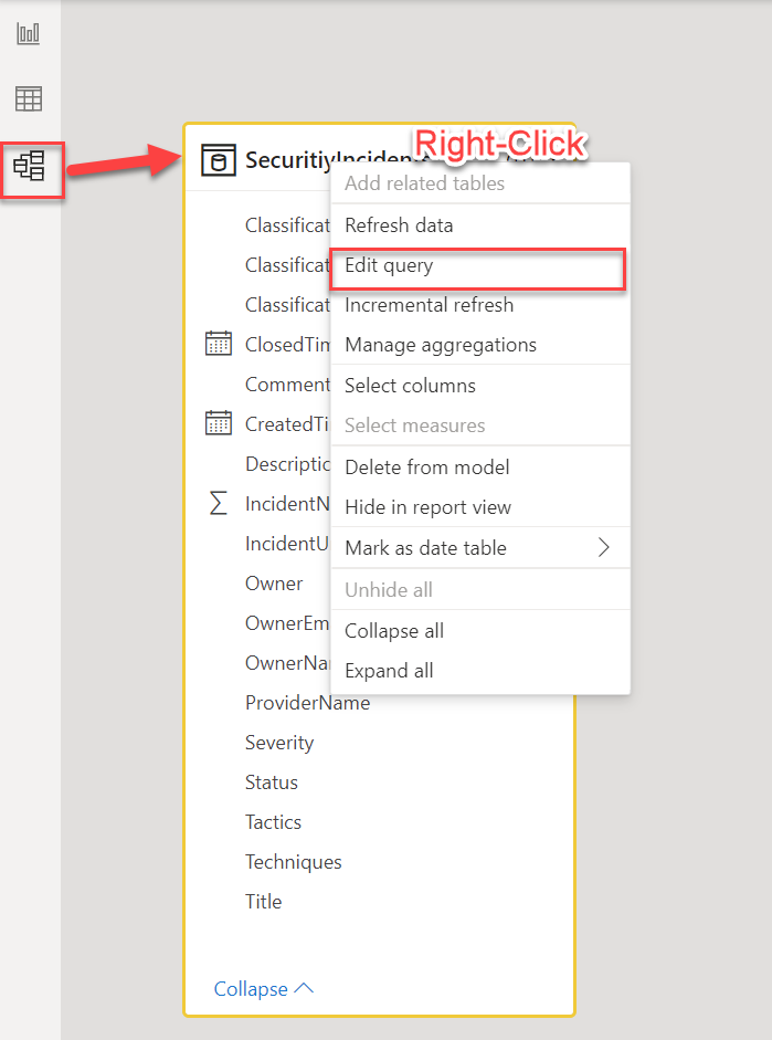
Click on the Model icon in the left hand PowerBI navigation area (the bottom icon) and then right-click in the title of the table that you want to modify. “SecurityIncidents” in this case. In the drop-down menu, select ” Edit query” as shown below
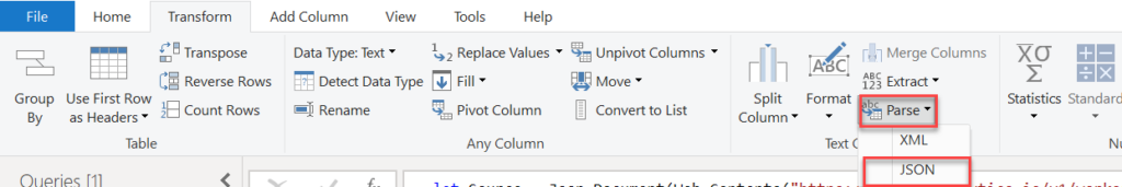
This will open a new Power Query Editor window with your table selected. This new window will show all the columns as well as a sampling of the data. Scroll to the right and select “Owner”. Then, in the header, select the “Transform” tab.
The “Owner” field is setup as a JSON array. This will make it easy to extract. In the “Text Column” section select the “Parse” drop down and then select “JSON” in the drop down menu.
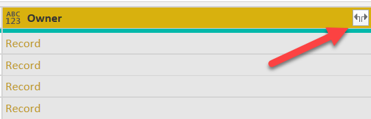
You will see that the data under the “Owner” column is now listed as a “Record”. This means that there are multiple values for each entry in that column. Next, we will extract that information.
Click on the extract button on the right side of the column header (it looks like two arrows pointing away from each other)
When you click on that, a new pop-up window will open asking you which columns you want to extract. By default, all columns are selected but you can unselect any if you don’t need them extracted. For instance, the “objectId” may not be that useful to you so you could uncheck it.
There is also a checkbox that asks if you want to use the original column name as prefix. I would suggest keeping this checked to avoid name collisions. You can always change the column names later.
Click on the “OK” button to continue.
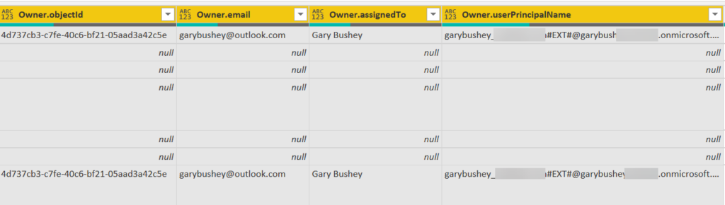
You will see that the original “Owner” column is gone, replaced by all the other columns that were part of the original JSON. You can now access these columns directly to get their values.
In order for all these steps to take effect, you will need to click on the “Home” tab and then click on the “Close & Apply” button which will close this window and apply the changes.
The great thing about the “Owner” column is that there will only be one entry for each incident. After all, each incident can only have one owner, even if that owner is a group. But what happens if there could be more than one entry? Let’s take a look at that now
Parsing JSON into multiple rows
Before we start this, go into your report and note how many incidents are listed in your pie chart that we created in the last post. We don’t need to know the breakdown, just the total number.
We are going to do the same steps that we did with the “Owner” column, but we are going to do it with the “Tactics” column. Note, you could also use the “Techniques” column as well. The big thing is that we want multiple entries in it.
The screen shot below shows the “Tactics” column after I have parsed the JSON in it, and I have clicked on the extract button.
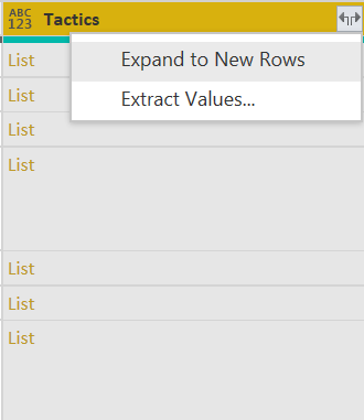
Notice that there is no pop-up showing the columns, only the ability to expand to new rows or to extract values. Expand to new rows will create a new row for each value. Extract values will extract each entry and use a delimiter that you select to delimitate between the different values.
Select the “Expand to New Rows” entry and notice that for each incident that had multiple values, a new row is created. This new row will have all the same information except for the “Tactic” column.
Go ahead and click on the “Close & Apply” button.
Now go back and look at the total numbers in your pie charts. Did they change? Most likely. This is because the total number of rows have changed. However, the entries in the table at the top of the page haven’t changed because that table does not show tactics. If you add the “Tactics” column to the table, you will see duplicate “IncidentNumbers” showing up.
I don’t know an easy way to solving without using different tables but maybe someone out there does? If so, leave a comment.
It gets even worse if you want to look at the “Comments” column. It parses into a List and when that gets expanded to new rows, each row contains a Record. Expand out that record and notice that “Comments.author” is yet another record. That expands out like the “Owner” column we discussed above. So, the column that holds the name of the comment’s author is called “Comments.author.name”. And, of course, a new row was created for each comment. If you expand this one and the “Tactics” column, you could have many different rows.
Linking tables
One of the great features of PowerBI is being able to link tables together, making it easier to get data from one table based on the data in another table. This is basis of most databases, so the concept may or may not be new to you.
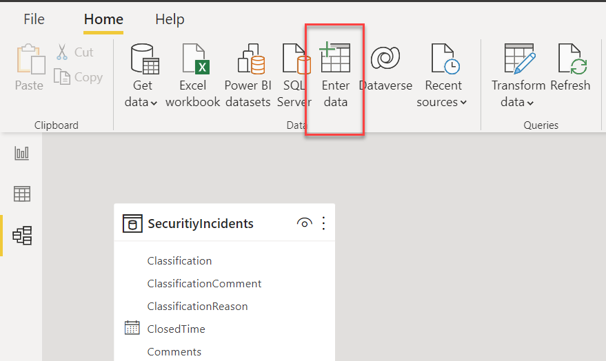
While we can easily do this with another query, we are just going to create a table within PowerBI and add values. From the main screen in PowerBI, click on the “Enter data” button.
This will open a new window that will allow you to enter new data. We are going to just add some description for the severities that the incidents may have. It is doubtful that you will really do this, but it shows you how to connect tables.
Enter the values for the different severities and give them a description. You can click on the column headers to change their name. You need to make sure that the severity names match what you will see in the “SecurityIncidents” table (which, I just noticed, has a typo in the name). The descriptions can be anything as can the name of the table. Here is how I have mine setup
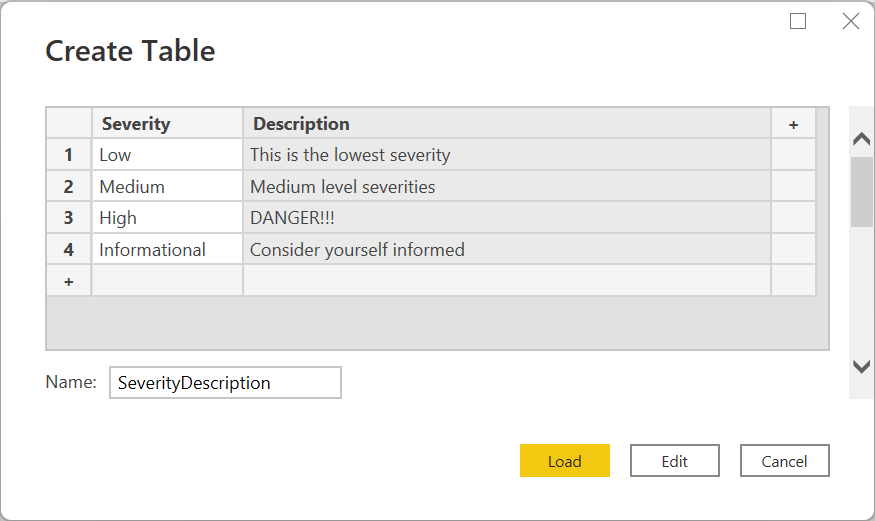
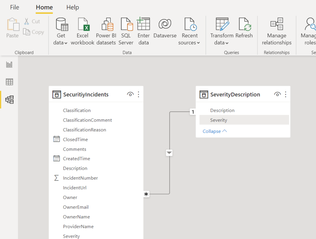
Once you have all the data entered the way you want it, click on the “Load” button to create the new table. The Model view should now look something like shown below.
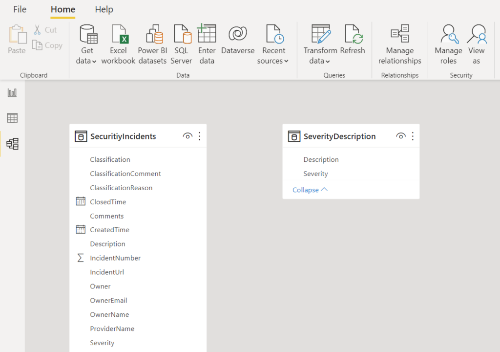
In order to map the two tables together, click on the “Severity” column from your new table (mine is called “SeverityDescription”) and drag it onto the “Severity” column in the “SecurityIncidents” table. You will see a connection line appear showing how the connection is mapped. In the image below the connection is showing that a single entry in the “SeverityDescription” can be mapped to multiple entries in the “SecurityIncidents” table. If you mouse-over the connection, it will show which columns are mapped together.
Go back to the report view. On the far-right side of the screen, you will now see both tables listed. Expand the “SeverityDescription” table and drag the “Description” field onto the table that is shown the incidents. You will now see the severity description that matches the incident’s severity. You can drag the “Severity” column from the “SecurityIncidents” table to verify.
Summary
In this post, we looked at how to work with tables. This is just the tip of the iceberg of what can be done. PowerBI is incredibly powerful so there is a lot more that can be done.
In the last post of the series, we will look at using PowerBI parameters in our queries.